
My blog has two sections: My short answers to the blog tour questions, and the longer answers that are included after the link to the next blog.
What is the title of your recently published book? Seasons--Rhymes in Time.
 |
| Seasons, Rhymes in Time: Illustrations from Sara Kahn |
Where did the idea for the book come from? Two authors, Peter Elman and Michael DeWall, asked me to illustrate 9 songs.
What genre does your book fall under? Children’s Picture Book; Music
What actors would you choose to play the part of your characters in a movie rendition? Crows!
Here's one, holding a chess piece:

What is a one-sentence synopsis of your book? Music, images and words: we have bundled a toolkit for your child's voyage to imagination.
Who is publishing your book? Chillin' Crow Books
How long did it take you to produce the first set of the illustrations? Two years, one year for the first version and one year for the second version!
Who or what inspired the illustrations? My plein air watercolor painting inspired me for the watercolors in this book, while in turn these illustrations made me refine my watercolor painting style in plein air.
 |
| Plein air watercolor painting, Briones Park 2012, Photo credit: Steve Kahn |
 |
| Watercolor.en plein air, Briones Park October 2012 |
What else about the book might pique this blog reader's interest? This book is self-published. I had to put together everything. The complete story follows…!
Constance Anderson is next on The Next Big Thing blog Tour,
check out her blog a week from today: May 23
.jpg) | ||
| Constance Anderson's new book: Smelling Sunshine Constance Anderson's website Star Bright Books
|

 |
| Sara Kahn's spot illustration for the "Spring Song" Sheet music page |
So here is the long story:
My most recent book: "Seasons--Rhymes in Time”, required me to put on several hats, some of which were completely new to me. These days self-publishing is getting easier and easier all the time, however producing a quality book that one will not regret having hundreds of copies of it in people's hands remains difficult.
The publisher's group of professionals, provide feedback in every step of the book, however, if you are taking the self publishing road, it is going to be a lonely road, you are on your own, so having a support group who will critique and guide your work becomes a crucial necessity. I feel so fortunate to have had the opportunity to get help from wonderful professional artists. Following is a listing of the hats I had to put on for this book and how I used help from my wonderful friends and acquaintances.
 |
| Sara's painting from 2008, Crow in Snow, Acrylic on canvas |
In 2011, two musicians/authors found my artwork on the SCBWI NORTH CA website that I designed years ago and contacted me.
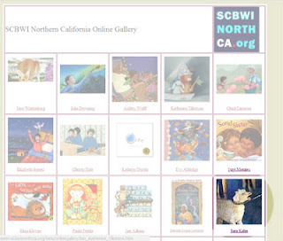 |
| http://www.scbwinorthca.org/bios/bioartists.htm SCBWI NORTH CA online gallery My web design from years ago My illustration is the one on bottom right. |
They wrote words and music for several songs, recorded them, and now were interested in finding an illustrator and putting out a book (self-published). They sent me a package with the text for 9 songs and a CD.
I liked the songs and decided to illustrate them—however, putting my art-director hat on, I noticed the songs did not have a theme. There were songs about celebrations, about food, and about nature. However, five of them related to the seasons: Two worked for summer, one for spring, one for fall, and one was about all seasons. I asked the authors to bring the four unrelated songs out of the collection and write four new songs. The authors accepted my rationale, and wrote four new songs for the book.
Then I put my book-making hat on. These are some of the ideas that I came up with for a book to accompany the CD. (images of the books here) The authors were very interested, but at the end they said what they really wanted was a traditional book. Then we discussed what size the book should be—however, the print broker they had hired “solved” that problem for us. She gave the authors a quote for a 8.5 x 11 hard copy book, and the authors accepted it.


Then I started working on the book. I put on my illustrator hat, the one that I have been wearing for over 20 years now. I did bunch of sketches in different mediums but felt I wanted the lightness and transparency of watercolors for this book.
During this process, CBIG (a wonderful organization in NYC which I wish was closer to SF!) announced they had a critique opportunity with the wonderful Pat Cummings--right when the first set of illustrations was ready. I knew I had to fly to New York for this opportunity. Pat looked at my illustrations and said, “Sara, you know I really like your illustrations, and these are lovely, but they look like postcards, you have to tie them together, in addition you need a living creature to make the illustrations exciting to the kids.”
All the way back home and many days after that, I was thinking about the creature I wanted to add to the illustrations. Among the many were the cat, and the dragon, but at the end, it was the crow. Crows fascinate me and they have appeared in my paintings before.
 |
| These are my paintings with crows in them:"Crow in snow" 2008 and "Winter garden" 2006 |
Then I remade all of the illustrations.
 |
| First version of the illustration for "I love Fall" song |
 |
| Fifth version of the illustration for "I love Fall" song |
 |
| First version of the illustration for "Somewhere it's snowing" song |
 |
| Forth version of the illustration for "Somewhere it's snowing" The entire concept changed when the crow was added. |
Many weeks later, when I was making the illustration for winter, I was not able to decide which illustration I wanted. I liked all of them! I asked for help from my artist friends on facebook and held a virtual critique group. These were the images I posted: 122 of my friends responded. 45 voted for #4. So this is the illustration that went into the book. (Thank you to everyone who voted!)
 |
| The facebook virtual critique group, voted on four different compositions I was contemplating for "Lady Winter" |
For the end papers I made a series of illustrations, which took days to finish. Then the authors did not like them. My rationale was that these abstract geometric forms will be a good transition to the organic shapes of the illustrations, but the authors thought it was not working. I decided on solid color end papers. The print broker said that the printer cannot do it. It was back to the drawing board. I came up with these stripes of colors that represented the four seasons.
 |
| First version of illustration for end papers, diamonds, each illustration had the colors of the season, this one is for Fall. |
 |
| Second and final version of the end paper, this is for summer on the left and Fall for the right. |
Then I had to put on my page layout hat. This was the very first time I laid out a book, so I contacted some wonderful very knowledgeable artists who provided excellent advice: Semadar Megged, Rachael Cole, and Kristine Brogno. (The colorful title is Kristine's idea)

The authors really liked the crow. In one of the meetings for the book, Pete, one of the authors, was looking at my illustration for “I Love Fall”, when he said: “look at this crow, he is just sitting there and chillin’,” and suddenly he said, “I know! I found the name for our publishing company: Chillin’ Crow Books.”
 |
| Detail from the illustration: "I love Fall" |
It was now time for the graphic design hat. Now that the publishing house had a name, it needed a logo. I sketched for several crow logos, and finally the authors and I decided on this logo. I rendered the logo in Adobe illustrator program. I then sent it to Monique Comacchio, who gave it the seal of approval.
| Logo design by Sara Kahn |
Finally I had to prepare the files for the printer. There were several problems during this process, one of the many was that the first proof had terrible muddy colors. I needed help: I thought of Cathleen O’Brien. I called her very late one evening and asked for her advice. Cathleen walked me through packaging the files on the telephone. It worked! The next proofs were near perfect. Hurray! Thank you Cathleen.